
Border I Korea by Yusuke Hishida
- Jul 10, 2018
- 4 min read
Updated: Jul 11, 2018
It is not unusual for photographers to produce work that rides the zeitgeist, however this long term project by Yusuke Hashida not so much rides, as positively preempts it.
Border I Korea, has behind it a relatively simple concept. To show the differences between the people and culture of the divided country of Korea. To look at their lifestyles, and how they go about the same activities within their respective parts of a country separated by a man made border, and governed by political ideologies that are the polar opposite of one another.
This beautifully produced volume from Libro Arte is a joy to handle. The tactile, rich red cloth cover is inset with a colour image from the book, which itself is cleanly and elegantly laid out. A minimal edit with a forgivably obvious layout. Two images side by side, one per page. Those from the North on the left of the book, and those from the South on the right. Each showing the same subject, and shot from the same angle.
Hishida’s gently toned images have a warm intimate feel. They are brilliantly composed and full of unexpected details that means the reader is rewarded with a new experience with every repeated viewing.
What makes this such a beautiful and appealing body of work is however, the fact that generally speaking, it does not come across as an overtly political statement. The differences are certainly there, in every frame. Some are almost as different as night and day, but many others are more subtle and nuanced.

Aerial shots of both capitals give the first hints. Both seemingly taken on a day with a slight haze in the air. The clean geometric "Sunday best" layout of Pyongyang's buildings interspersed with neatly grouped trees, complimenting, rather than detracting from Seoul's more colourful random architecture, and "dressed down, street casual" appearance.
The subtleties continue with portraits, notably students, captured (both singly and in groups) posing straight for the camera. All immaculately turned out, only their dress giving any indication of the difference between them. Two boys, both looking intently into Hishidas's lens. The student from the North, in a very formal minimalist uniform, a red kerchief around his neck, standing in front of an austere grey building. The other from the South in a smart but relaxed sweater and jacket. This time in front of a more colourful row of shops that make up the background. Subtle, but the indications of variation in structure and formality, not only in regard to dress, but also in lifestyle almost immediately becoming apparent.

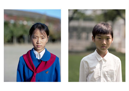
Then the equivalent shot of two girls. Again, the North in formal uniform, as opposed to the softer more feminine dress of the other. The student from the South relaxed also sporting a backpack and holding a mobile phone. The other almost military in her stance, no frivolous accessories here. In the South image, two friends can be seen sitting on a wall in the background smiling and laughing. In the North two young faces, barely visible look inquisitively out from behind the closed window of a first floor room.
And so these juxtapositions continue, social gatherings, public spaces, classrooms, buses, trains. Hishida's lens captures them all with a lightness that almost makes you forget that many of these are controlled and posed images.
Then there are those that really strike a chord. Amongst them a street scene of people going about there daily routines. The North image once again showing men and women in largely monochrome outfits walking past beautifully maintained grey buildings with manicured trees and greenery flanking them. The South image, once again what most of us would perceive as normality. Colourful shop fronts selling familiar branded products, and a healthy ethnic mix of people to be seen lining the pavement. A relaxed image that could be a main street virtually anywhere. However the eye is drawn directly to the advertising billboards pretty much central to both images, which leave us in no doubt as to the differences between this divided country. The North, a propaganda image not dissimilar in style to those of the Russian posters that first appeared around 1917. A fist driving down into a map of the United States and the image of a cowboy. Without doubt an unambiguously anti American statement. On the south side....a colourful advert for MacDonald's.... and let's face it, it doesn't get more American than that.
With potential talks between not only the North and the South Korea, but also North Korea and America, currently on and off more frequently than a light switch, one can only hope that Yusuke Hishida has created a document that the next generation of Korean's will be able to look at together, only this time, as part of a history lesson.
And as for all those beautiful juxtaposing photographs. Hishida has produced two sets of images that by themselves put everything into perspective. Firstly two new born babies in their respective hospital cradles, and secondly two images of trees, laden with cherry blossom. Both sets of subjects unaware of borders, and both with their very futures in our hands.
Think about these two sets of innocents - both helpless and dependent in their own way - carefully enough, and in a sane world, they and their future by themselves should be enough to make that imaginary line just go away.
We can only hope.


Comments